During the production of creating my magazine, I looked at a variety of existing magazines to meet up with same conventions of any music magazine present today such as Q magazine and NME. From researching closely at these magazines, I discovered that the conventions of any magazine were to follow the rules and regulations so that the production of my magazine would be similar to these. From analysing a magazine cover, I had noticed that the magazine used bold lettering and that the use of colour for the title was strong and appealing for the audience. The title block would always be placed on the top of the page to make it visible for the audience to see. I noticed how the central image was placed, the type of shot that was used and how the texts were situated to relate to the way the magazine portrays the image. I also took in how the buzz words and the puff words were situated on the cover. The magazines that I analysed closely were Q magazine and NME. As my magazine was not based on a British music genre, I also looked at magazines that related to the genre that I have chosen, Korean Pop. I chose to research on Korean magazines and came across Teens magazine. I looked at what details or techniques they had used to appeal the audience and whether they were similar to British magazines.
As I wanted to use Q magazine to guide me through the production of my magazine, I knew that I had to research other magazines that were closely matched to the genre that I am doing. But I did use features of Q magazine such as the use of colour and how they kept their signature throughout the magazine. I have tried to include this in my magazine as exact as I could possibly create it such that the magazine can be successful as the way Q magazine has inspired me to. Q magazine also inspired me to create a house style magazine as I have tried to do so throughout the creation of my magazine. During the creation of my magazine, I had to create a questionnaire for the audience. The questionnaire will then give me feedback of what the audience’s expectations were towards a magazine and what they would want in the magazine.
I gathered the results from the questionnaire and had aimed it at young adults at the age of 16-23. The questions that were asked had given me the influence that the audience is female. As my magazine is based on Korean Pop, the cultural and racial differences would be is that the target audience that will be more appealed to are Orientals such as Chinese, Vietnamese, etc and that other race and cultures would not be interested as much. Using the internet I had looked into what age group that are currently reading music magazines and the results shown were that young teenagers’ age between 16-20 would have a major interest in the genre music, Korean.
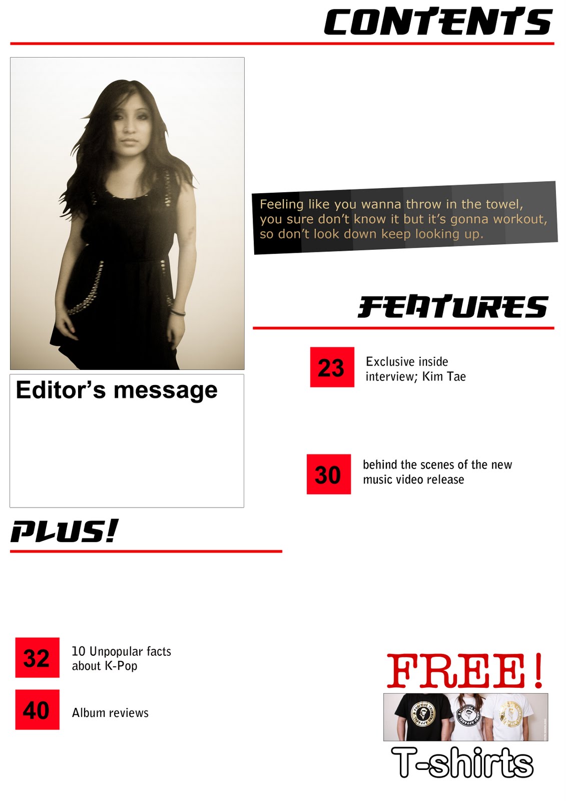
To attract my audience I have attempted to do this by adding music reviews, interviews and competitions. This can be seen from the results gathered from my questionnaire. From analysing Q magazine, I have tried to use the same conventions that they have featured onto my front cover however as my magazine is based on Korean Pop, I had to keep it within the theme. Also, the images that were taken had to follow how the magazine portrays the theme or the issue of the month. I had to take note of this not just the front cover but also the contents page and the interview double page spreads. On my contents page, to keep the connection of the flow of the magazine, I have used images that would relate to this. For example, on the right hand bottom corner there is an image and text referring to “Free! T-shirts” showing the link to the image. I have done this as this will easily attract the reader’s attention. I have also included double page spreads that contains an interview. The images that were used were carefully taken as the images will represent the understanding of the interview so that the reader would immediately know about it. Being aware that young female teenagers and adults tend to have a role model to look up to as this will give an inspiration to hidden talent. It also depends on how the image was taken in a type of camera shot. On the first double page spread, I have decided to use a mid shot image to allow the audience to have a browse at the new artist. I have carried on through out the second double page spread in order to keep the audience to keep discovering the new artist.
Having previously done research on publishing institutions I should choose from that would be best suited for my magazine. As having a look at a variety of different institutions I came across with Bauer as having distributed Kerrang, kiss 100 and a number of fashion/gossip magazines such as Closer. I also came across to another institution, IPC Media which is also on the same level as Bauer being the next biggest media institution. IPC Media institutions distribute magazines that have a major topicality such as fashion and gossip and are hardly distributing music magazines except for NME. This then makes the decision of what distributer that I would like to help distribute my magazine and that is Bauer. This is because they do not just concentrate just on one genre but has a look at various other magazines such as gossip, men magazines and also own a number of radio stations. So therefore this will easily engage readers as they have a large and wider audience. This will help gain quicker publicity and faster sales for my magazine.
During the production of my magazine, K.Tunes, I have learnt and developed my designing skills via the software Photoshop and Paint. Using the programme Photoshop has helped me create and edit images from different functions such as the gradient to change a plain image to the final image that I wanted for my magazine cover, contents and the feature double page spreads. The use of the Internet had helped enormously as it showed me different websites to search for different variety of fonts. As my magazine was based on Korean Pop, it was very hard to design a title block to emulate the genre of K-Pop. The website that I had come across with was www.dafont.com as it had a range of font representing different culture and ethnicities. I had used Paint as the software was easier to use to make symbols and characters such as my title block has a half circle attached around the “K”.
In such little time, I have learnt and developed several skills when creating my magazine, “K.Tunes”. I have now considered what the main points are to make a successful magazine such as the right audience, the right photography meaning the right shot that was taken and finding the right distributor so that the magazine would have good publicity in short space of time. Essentially, I have learnt to keep in touch with the audience and the genre type. From designing the preliminary task, it has helped me enormously when designing my magazine. As I have no idea of what the conventions are of a magazine, how the magazine was laid out, what articles should be used and what programs to use to help develop pictures better, it was difficult for me to start processing the magazine. Creating the college magazine had helped me have an idea of what the software Photoshop does so the process of creating was very basic and lacked skills. As I was assigned to create a college magazine, my target audience were to college students so that meant taking pictures of college students and trying to find out what college students would expect to read in a magazine. In order to find out I had to produce a questionnaire and hand out to people around college and as I have not done this before, I knew that it would help me improve one of my communication skills otherwise this would be a downfall and my magazine would be unsuccessful. I have realised that in order to make a successful magazine a large amount of research and analysis of different magazines must be put forward and had helped enormously in my production work.


